
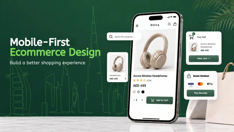
A customer may first discover an online store while scrolling through Instagram, searching on Google, opening a WhatsApp link, or clicking a digital advertisement. In many cases, that first visit happens on a smartphone.
Mobile-first ecommerce design begins by thinking about what the shopping journey should feel like on a smaller screen. Instead of creating a large desktop store and reducing it later, businesses consider mobile navigation, product discovery, content, buttons, forms, images, and checkout from the beginning.
For United Arab Emirates e-commerce businesses, this approach can make online shopping faster to understand and easier to complete wherever customers are browsing.
Mobile Customers Need Faster Decisions
A smartphone screen has limited space. Customers cannot see large menus, several product columns, long descriptions, and multiple promotional sections at the same time. The design needs to decide what information deserves attention first.
Product names, prices, important images, availability, and purchase actions should be easy to identify. Secondary information can remain available without competing with the main shopping decision. Good mobile design creates priorities. It helps customers understand what matters without filling every part of the screen.
Keep Mobile Navigation Simple
Desktop websites may have enough space for detailed navigation, but mobile stores need a more focused structure. Categories should use familiar names, and the menu should not require customers to open several layers before finding products.
Search can also become more important on mobile because some customers want to reach a specific product immediately. Navigation should support both browsing and direct searching. A customer who knows exactly what they want should not have to follow the same path as someone casually exploring the catalogue.
Design Product Pages for Small Screens
Mobile product pages need to communicate value without overwhelming customers. Images should display clearly, and customers should be able to move through them comfortably. The product name, price, main options, and purchase action should remain easy to locate.
Long descriptions can be organised so customers can access more detail when needed without scrolling through large amounts of text before reaching important actions. Size selectors, colour options, quantities, and variants should also be comfortable to tap.
Businesses developing new online stores can use MAQ e-commerce development services to plan product presentation, shopping journeys, platform requirements, and e-commerce functionality together.
Buttons Should Be Easy to Tap

A button that works perfectly with a mouse may be frustrating on a smartphone. Mobile users interact with websites using their fingers, so buttons and links need enough space around them. Important actions should not be placed so close together that customers accidentally select the wrong option.
Add to cart, buy, search, menu, account, and checkout actions should remain easy to identify. The visual design should also make the primary action clear. When several buttons compete for attention, customers may hesitate instead of continuing.
Avoid Making Customers Type Too Much
Typing on a smartphone requires more effort than using a desktop keyboard. Forms should therefore ask only for information that is genuinely required. Address fields, phone numbers, names, and other details should be presented in a logical order.
The website should also make errors easy to understand. Customers should not complete a long form only to discover that one unclear field prevents them from continuing. Reducing unnecessary typing is especially important during checkout, when the customer is already close to completing the purchase.
Mobile Checkout Should Feel Predictable
A customer who reaches checkout should understand what remains before the order is complete. Order details, delivery information, payment choices, and totals should be clear. Customers should not be surprised by important conditions only at the final stage.
Checkouts should also avoid unnecessary distractions. The purpose of the page is to help the customer complete the order confidently. Businesses using Shopify can review MAQ Shopify services when they need support with store setup, theme customisation, checkout-related configuration, integrations, or wider Shopify improvements.
Use Images Carefully on Mobile
Ecommerce stores need strong visuals, but large image files can create performance problems. Businesses should balance image quality with website speed. Product photography needs enough detail to help customers make decisions without creating unnecessary loading delays.
Mobile layouts should also avoid decorative images that occupy valuable screen space without helping the shopping journey. Every visual should have a purpose, whether that purpose is explaining the product, building confidence, or supporting the brand.
Make Filters Practical on Smaller Screens
Filtering can become difficult when an e-commerce store offers many products. On mobile, filters should be easy to open, select, apply, and remove. Customers should understand which filters are currently active without having to restart the search.
For fashion, useful filters may include size, colour, category, price, and collection. Other stores may need brand, specification, compatibility, or availability filters. The objective is to help customers reduce a large catalogue into a manageable set of relevant products.
Think Beyond the Homepage
Mobile design should not focus only on making the homepage attractive. Customers may enter the website directly through a product page, category page, campaign landing page, blog article, or search result.
Every entry point should provide enough context and navigation for the customer to continue shopping. Businesses should test complete journeys such as arriving on a product page, checking variants, adding the product to the cart, reviewing delivery information, and completing checkout.
MAQ web design services can support businesses in reviewing responsive layouts, website usability, content presentation, and customer journeys across screen sizes.
Test the Store on Real Devices
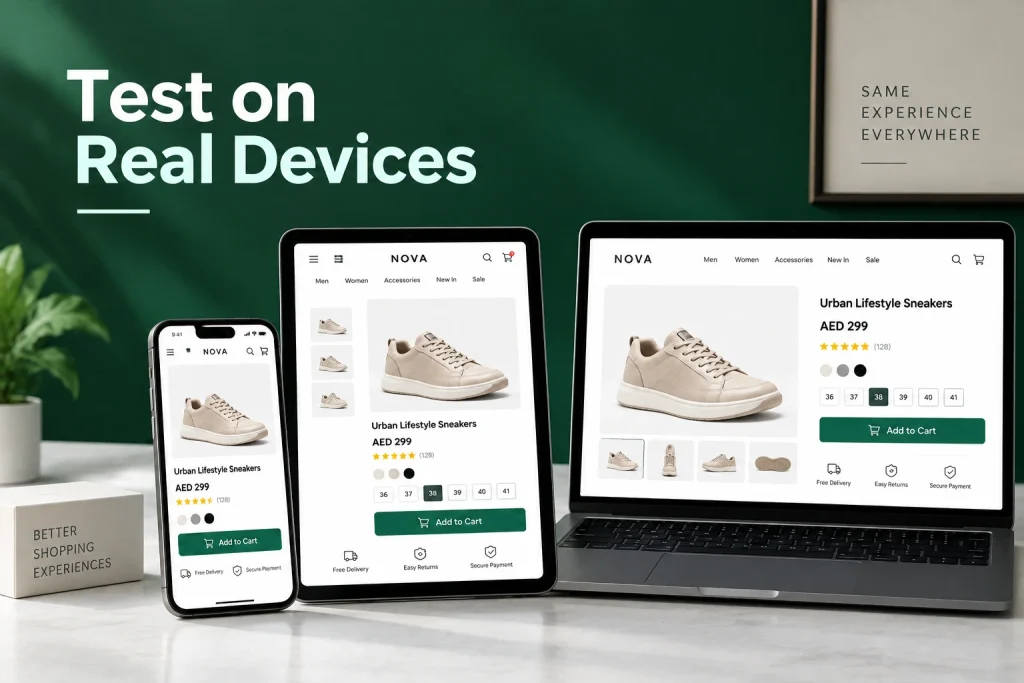
A design preview can show how a page is expected to appear, but real device testing often reveals different problems. Buttons may feel too small. Popups may cover important content. Product images may take too long to load. Forms may be difficult to complete. Menus may require too many steps.
Businesses should test important journeys on different screen sizes and browsers, especially after major theme, app, design, or checkout changes. Testing should also continue after launch because e-commerce websites change as new products, campaigns, integrations, and features are added.
How MAQ Supports Mobile Ecommerce Experiences
MAQ Computer Services LLC supports United Arab Emirates businesses with e-commerce development, Shopify development, responsive web design, integrations, and mobile-focused digital experiences.
A project can include reviewing product discovery, mobile navigation, responsive layouts, store speed, shopping flows, checkout usability, platform functionality, and the connection between the online store and other business systems.
The objective is not simply to make a desktop website fit a smaller screen. Mobile e-commerce should be designed around how customers actually browse, compare, select, and purchase products. A better mobile experience can also make paid advertising, social traffic, search traffic, and direct customer visits more valuable because customers reach a store that is easier to use.
Design for the Customer Holding the Phone
Mobile-first e-commerce design is ultimately about reducing effort. Customers should be able to understand the store, discover relevant products, read important information, choose options, and complete purchases without struggling with the interface.
Businesses should not assume that a responsive website automatically provides a good mobile shopping experience. Real usability depends on navigation, content priorities, speed, forms, buttons, product presentation, and checkout behaviour. When those elements work together, the smartphone becomes a convenient shopping channel instead of a smaller version of the desktop store.
Frequently Asked Questions
What does mobile-first e-commerce design mean?
It means planning the e-commerce experience for mobile users from the beginning and then adapting the design for larger screens.
Is responsive design the same as mobile-first design?
Not exactly. Responsive design allows pages to adjust to different screens. Mobile-first design begins with the needs and limitations of smaller screens when planning the experience.
Should mobile e-commerce pages have less content?
They should prioritise content more carefully. Important information should remain available, but it can be organised so customers are not overwhelmed.
How can businesses identify mobile checkout problems?
Analytics, customer feedback, device testing, form testing, and checkout funnel data can help reveal where mobile customers leave the purchasing journey.
Should desktop e-commerce design still be important?
Yes. Desktop users still need a strong experience. Mobile-first design establishes priorities for smaller screens while allowing larger screens to use additional space effectively.



![Must Have Shopify Apps in 2021 [FREE]](https://blog.expertsinshopify.com/wp-content/uploads/2021/02/custom-shopify-app-600x400.jpg)
